Skip to content
As Map Complexity Cartographer
Data Curious Notebook
As Map Complexity CartographerAs Map Complexity Cartographer
  • Réalisations
    • Logo
      • Logo Numerich
      • Logo : UDON
      • Logo : DON’T KILL THE COW
    • ISOMAP : 3D Resume
    • Emerge Map
    • Couv 101 Astuces
    • Management V1 / V2
    • 1984
    • SACRED UNION 2.0 => KILLING = BLASPHEM
  • Tools
    • Geyser of Infoviz
  • Mentions légales
  • About
  • EmergeMap
  • Infoviz Reperage

Daily Archives: February 6, 2017

You are here:
  1. Home
  2. 2017
  3. February
  4. 06

Quel Diagramme pour dire quoi ? Chartopedia by @AnyChart thx @Crid

InfoVIZBy Arnaud Velten @Bizcom Stratégie & Tactique DigitaleFebruary 6, 2017Leave a comment

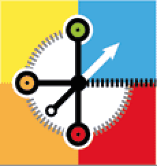
#Chartopedia is an information resource that allows you to discover as many details about any type of chart supported in Source: Chartopedia | AnyChart

#Ressources #Datajournalism #tools collection by @journocode via @Crid

InfoVIZBy Arnaud Velten @Bizcom Stratégie & Tactique DigitaleFebruary 6, 2017Leave a comment

A collection of #tools for all your journocoding needs. Filter your search to find just the kind of tool you are looking for right now. Source: Data journalism tool collection | Journocode

As Map Complexity Cartographer
 Dream-Theme — truly premium WordPress themes
Go to Top